So when I saw a video with both Keanu and Rudd, I was on board! The below video is a little long, but hilarious. Well worth the watch:
Thursday, January 28, 2016
Just Because: Anyone Can Quantum
I am kind of a comic book geek, and while I like the Marvel movies, I was hesitant about Ant Man. He is cool and all, but I was on the fence. Then I watched it and loved it. It is super funny and I now understand why the world loves Paul Rudd. Another actor I love is Keanu Reeves. Watch Constantine and you will know why (thanks nana!). John Wick is also really great.
So when I saw a video with both Keanu and Rudd, I was on board! The below video is a little long, but hilarious. Well worth the watch:
So when I saw a video with both Keanu and Rudd, I was on board! The below video is a little long, but hilarious. Well worth the watch:
Wednesday, January 27, 2016
Illustrator: Kale, Arugula, and Swiss Chard
I worked on a commission gig today for some leafy greens and this is what I have so far:
 I am not sure how much I love them. I did come up with a pretty great alternative option for the kale, but now I feel like I need to do something with the Swiss Chard to balance the three back out. I haven't quiet figured it out, but I am optimistic.

Tuesday, January 26, 2016
Barn Owl: Part 3
Slowly making progress. Now that the main body of the owl and background are painted in, I just need to wait for it all to completely dry before I finish off the details. I have three ideas for how I want to finish the painting. Hopefully I will have decided which idea I like the best by the time it is dry.

 To see past progress images of the Barn Owl take a look at Part 1 and Part 2.
Monday, January 25, 2016
How to Avoid Mixing Muddy Colors

Lord Frederic Leighton, "Cymon and Iphigenia," 1884
Keeping your colors crisp and bright, even when painting with a more subdued tone, can be difficult and frustrating for any artist at any stage. Below are some tips on how to avoid muddy color mixtures:
1. Limit Color Mixtures to Two or Three Pigments
Adding more than two or three pigments (excluding black and white) into a mixture can cause paints to grow dull and muddy. If you find that you are using more than three pigments, pause and reconsider your approach. You may need to go and purchase a different pigment.
Black and white, though, are not included in the two-to-three limitation as they change the value of the mixture and have less of an effect on the core color.
2. Avoid Using Cheap Paints
Cheap, or student grade paints are full of fillers. When mixed together the amount of filler will overwhelm the amount of pigment and create mud.
3. Avoid Mixing Compliments
A perfect complimentary mixture, say of yellow and purple, will create gray. An imperfect complimentary mixture, say of a slight greenish-yellow and purple, will create brown. It is almost impossible to find a perfect compliment with paints straight out of a tube. Because of this, avoid mixing compliments.
4. Avoid Over Mixing
When mixing a color combination on your palette, do not blend the mixture into a perfect uniform blob. This will cause the paint to lose some of its light and vibrance. Instead, when mixing, do not over mix. Allow the mixture to finish mixing while being painted onto your canvas.
5. Use Both Mixtures and Straight Pigments
While painting use both mixtures and paint straight out of the tube. This will help colors to appear bright.
6. Maintain a Light Color and a Dark Color Paint Brush
While painting use one paintbrush only for light areas, and another only for dark. It can take some time to get used to switching back and forth between your two brushes (in fact, I am always messing up), but it is worth trying. This will help keep your darks dark and your brights bright.
I usually have three brushes: one for lights, one for darks, and one for mid-tones.
7. Use a Clean Brush for Blending
Just as over mixing your colors can cause problems, so too can over blending with unclean brushes. If you want two sections of paint to blend, pick up a clean brush (fan or other), and blend the two colors with the clean brush and not with your used brushes. Not only will this make blending easier, but it will also limit the introduction of additional paint which can muddy your blend.
If you have any questions or tips that I did not think of for avoiding muddy colors, leave a comment! To read more tips about painting, check out my main Tips and Techniques page.
Friday, January 22, 2016
Just Because: Color Perception Tests and Boredom
In college I had a professor who was just a weird dude. He considered himself a mark above the other professors in both talent and teaching ability (this was pathetically not true), and particularly considered his eyes to be "color experts." His color hubris was so strange to me. I mean, obviously everyone wants to have good eyes, and particularly as an artist you want to be able to discern color well. But what is the point of being better than everyone else, when literally no one would be able to see that you are?
Maybe I am just jealous. I do not have the best color perception. I mean it is good, like totally above acceptable, but I do have a hard time with green-blues. I know this because sometimes when I am looking at green-blues my eye balls go crazy, and there are also the scores I get on perception tests.
I got super bored today which means like any normal person I turned to color perception tests for entertainment. Obviously this is something everyone does, right?
Would you like to know how well you discern color? Now I don't mean like whether or not you are color blind, but whether or not you can "see" color correctly.
Below are some links that I highly recommend for testing your color perception. To take the test or game click on the title link below:
The Color Game
 During the game you have one minute to click on the different colored squares. As the game continues it increases in difficulty.
My highest score is 47, but I usually land in the high to mid 30s. But then there are those times when I barely make 20 because I get stuck on this bright, old school blue that I just can't see.
Farnsworth Munsell 100 Hue Test

This will tell you where you have a color deficiency. I do! I score three, always, on this test. Always in the same range of green-blues. Husband gets a perfect score of 0.
Fun Fact from the site: 1 out of 255 women and 1 out of 12 men have some form of color vision deficiency. I guess that means I am that 1.
Color

This test also increases in difficulty, and as it goes it can sometimes be confusing as to which color you are controlling. I recommend taking more than one stab with this one. My highest score is 9.2, but I generally get around 8.9.
So, what did numbers did you get?
Maybe I am just jealous. I do not have the best color perception. I mean it is good, like totally above acceptable, but I do have a hard time with green-blues. I know this because sometimes when I am looking at green-blues my eye balls go crazy, and there are also the scores I get on perception tests.
I got super bored today which means like any normal person I turned to color perception tests for entertainment. Obviously this is something everyone does, right?
Would you like to know how well you discern color? Now I don't mean like whether or not you are color blind, but whether or not you can "see" color correctly.
Below are some links that I highly recommend for testing your color perception. To take the test or game click on the title link below:
The Color Game

My highest score is 47, but I usually land in the high to mid 30s. But then there are those times when I barely make 20 because I get stuck on this bright, old school blue that I just can't see.
Farnsworth Munsell 100 Hue Test
This will tell you where you have a color deficiency. I do! I score three, always, on this test. Always in the same range of green-blues. Husband gets a perfect score of 0.
Fun Fact from the site: 1 out of 255 women and 1 out of 12 men have some form of color vision deficiency. I guess that means I am that 1.
Color
This test also increases in difficulty, and as it goes it can sometimes be confusing as to which color you are controlling. I recommend taking more than one stab with this one. My highest score is 9.2, but I generally get around 8.9.
So, what did numbers did you get?
Tuesday, January 19, 2016
A Gallery Show for Me!
One of my goals for last January was to get into the Hogle Zoo's World of the Wild Art Show, but then Husband's cousin moved in with us and then died and all of my goals were set back by, well, a year.

Now that it is January again, it is time to finally complete some of these goals. Today I got an email telling me that both my Pronghorn and Ram paintings were accepted into the Hogle Zoo show. It is a small thing, but baby steps, right? I am excited.
I am a little bummed that I didn't finish the Barn Owl in time, but I think it was a good thing that I am not rushing through painting it.
Illustrator: Ginger Ale
Many moons ago I worked as a trainer for Nu Skin Enterprises. For some reason my team started doing taste tests as part of our team meetings. A blog was even started, The Taste Testers. We were going along at a pretty good clip when two of my co-workers, incidentally one of which was the owner of the blog, got hung up on ginger ale for four and a half years. (rolling eyes)
They wouldn't let it go and all other taste testing ended. On Monday, after waiting for years, the ginger ale testing was finally over at 200 different types of ginger ale.
I thought it only appropriate that I make them their own little commemorative illustration:

They wouldn't let it go and all other taste testing ended. On Monday, after waiting for years, the ginger ale testing was finally over at 200 different types of ginger ale.
I thought it only appropriate that I make them their own little commemorative illustration:
Monday, January 18, 2016
How to Correct Dull, Sunken Colors: Oiling Out Vs Creating a Couch

This can happen for a couple of reasons: 1. The ground you are working on is extra absorbent and is sucking the oil from your paint, or 2. You are using too much solvent in your medium solutions.
Luckily the solution, oiling out, is simple, but the application from artist to artist can be varied.
Oiling Out During The Painting Process
Oiling out is simply a process by which a medium is applied over the dull area in order to bring back the area's luster. How this is done varies from artist to artist, but the general steps are the same:
1. Using a brush or makeup sponge, apply your oiling out medium either over the entire painting or just over the dull area. Some oiling out medium solution options are as follows:
- 50/50 Oil Medium to Solvent
- Straight Linseed or Walnut Oil Medium
3. Wipe off your medium with a lint-free cloth or paper towel.
- I first learned to oil out by repeating steps 1-3 first with straight solvent and then with straight medium. When I have done this, a small amount of paint will lift off onto my towel. While it does work well at bringing the dull areas back to life, because of this I have stopped using this method.
Oiling Out After the Painting is Finished
Because I do not use solvents while painting, I tend to not have a terrible time with my paints sinking; however, this does not mean that I do not oil out. I like to oil out my paintings when they are finished. To oil out a painting when finished, you can use the same process above or increase the oil content of your mixture for greater gloss.
I like to use 70/30 Stand oil to Solvent (or rather my Walnut Alkyd Drying Medium, as again I do not use solvents).
Oiling out once your final painting is dry to the touch helps even out glossy and dull areas. This should always be done before you varnish a painting. I will be discussing more about varnishing in a future post.
Below are two videos. While not of awesome production value, they do explain Oiling Out wonderfully:
Creating or Painting into a Couch
Oiling out and creating a couch are similar, but are used to do different things. A couch is a thin layer of medium that is not meant to luster dull areas, but rather to create a thin layer you can paint into. Your couches should be the same as the medium solutions that you are using for that particular layer.
For example, if I am using 3 drops of Walnut Oil to 3 drops of Alkyd for the layer that I am working on, my couch will be made of the same solution. To paint a couch do the following:
1. Apply your medium solution only over the area you plan to paint.
2. Allow to sit for two minutes.
3. Wipe off excess medium.
4. Start Painting.
Couches allow for even medium usage throughout the layer; as the medium is already up on your canvas, you will not need to dip your brush into more medium. Couches are also ideal for glazing.
I love couches, but I do not use them all of the time. I have found that for some textures I will use a couch and for others I will not.
To read more about Oiling out, I recommend reading here and here. For more videos go here and here. If you have any questions about Oiling out, please leave a comment. For more about Oil Painting check out my main Tips and Techniques page.
Friday, January 15, 2016
Barn Owl: Part 2
So I was trying to finish the Barn Owl for a gallery gig that is due tomorrow, but I misread the entry forms. The submission is not a digital submission with another week or so before you find out if you made it. This one is a physical submission.
I am smart (shaking head no). Not super bummed about it, though. I am going to submit my Ram and Pronghorn instead. This will allow me to get some serious detail into the feathers of the Owl. All good things.
Below are progress shots up until about 3 o'clock when I reread the papers and decided to take a break:

 The back wing is a little bit darker than in the image, the gloss from the couch I painted into is still pretty shinny.
To see the beginning shots, take a look at Barn Owl: Part 1.
I am smart (shaking head no). Not super bummed about it, though. I am going to submit my Ram and Pronghorn instead. This will allow me to get some serious detail into the feathers of the Owl. All good things.
Below are progress shots up until about 3 o'clock when I reread the papers and decided to take a break:
To see the beginning shots, take a look at Barn Owl: Part 1.
Purple Oil Paint: Pigments, Basics, and How to Pick the Right Purple

This is due to three things: a purple pigment for paint does not exist in nature; blue, at the time, was a rare and an extremely high value pigment; and purple organic dye was very expensive and very fugitive as a paint pigment. By fugitive I mean it would fade like nobody's business.
Blue pigment was more expensive than gold, therefore using blue to mix purple was a status symbol. The purples that we see in old master works were mixed from blue, such as in the works by Giotto.
Purple dye dates back to the Phoenicians, Phoenicia meaning "land of purple." The organic Tyrian Purple dye was made from a small gland of the murex sea snail. Thousands of snails would be captured or bred, then with shells removed they would

Now that doesn't mean purple was not used, it was just very expensive to use. Much like orange and red, purple as a pigment did not come into its own until the 19th century when at eighteen William Henry Perkin created the first synthetic purple called mauve.
Top Characteristic: Purple can be used to create deep, full shadows, and is essential for botanical and nature painting. Look for purple shadows cast off of yellow buildings and plants.
Purple is sometimes considered to be one of the least necessary paint pigments to purchase, because it is so easy to mix. However, it is important to note that some purples, such as Cobalt Violet, cannot be mixed.
Pigment Numbers (PV#): Along with the paint names, I have also included the pigment numbers. Look for these numbers to make sure you are purchasing a true purple and not a cheaper mix, as purples can sometimes come with various names.

Because Cobalt Violet is so weak you will not always find it in its pure form, but rather mixed with its cleaner and stronger cousin Manganese Violet (PV16), which gives the paint more body, but the color does change slightly. Pure Cobalt, because it is so weak, mixes poorly and becomes gray, but as a final coat or glaze it sings.
Cobalt Violet was used by artists such as Monet and Seurat.


A little redder than Cobalt, Manganese can give an artist the strength and body that Cobalt lacks. When mixed with white it creates a warm lavender tint. It is considered to be the original mauve pigment.

When looking for this color particularly, check the paint label for the pigment number because its names are so varied.

Considered the strongest tinter and most transparent of any pigment, Dioxazine is so dark (the sample swatch was painted extremely thinly so you could actually see the purple color) that it can be used as a deep black. It is advised to use it sparingly because it is so strong, but when used correctly it creates lovely purples and tints. It is also the most commonly used purple.
How to Pick the Right Purple
Like orange, you can hold off on purchasing a purple until you have acquired some of the more necessary paints. That being said, I love having a Dioxazine Purple to work into dark backgrounds, and purples are necessary for botanical paintings.

Both the Lilly and Chuck Norris's backgrounds were painted first with Burnt Sienna, then Pthalo Blue, and finally darkened using Dioxazine Purple.
Remember, when you are picking which purple to paint with always consider the following characteristics: color temperature and tinting strength (opacity doesn't really come into play as most purples are transparent). For a warm purple first consider Manganese Violet (depending on the provider the name can differ, check for the pigment number PV16) and for a cool purple Dioxazine Purple.
For more about colors and their pigment characteristics take a look at my Tips and Techniques page.
Purple used throughout Art
Below are some wonderful examples of purple in art in the following order: Giotto, Fyodor Rokotov, John William Waterhouse, Van Gogh, Klimt, and David Hockney.


Thursday, January 14, 2016

Wednesday, January 13, 2016
Delve Video Essays: The Long Game Parts 1, 2, and 3
Below are three video essays on the importance of the "long game" as an artist and the necessity to see the hard times through. Obviously the ideas presented here can apply to anyone, not just artists.
Colossal - Painting in the Dark
Colossal - Painting in the Dark
In the age of social media and the over-saturation of information, seeking recognition as an artist or designer can at times be a difficult, self-defeating effort. Creative individuals understandably have high expectations for the reception of their work, and hope for a public response that correlates with the labor spent on its products. In Adam Westbrook's new video essay[s] we get a fantastic argument against the perceived value of modern popularity tied to social media likes and shares.
I am not 100% solid on the ideas presented in the videos. Mostly because I don't think that you are less of an "artist" for wanting recognition, nor do I think you are more of an "artist" because you suffer for art's sake as a complete autotelic. However, even with that, it can be helpful to have some perspective.
What do you think? Should the end goal be autotelicy (made up the word), or being able to feed yourself doing something that you love?
Also, I think that I will be creating a new link for my Art Tips and Techniques page, something like Helpful Videos for Artists.
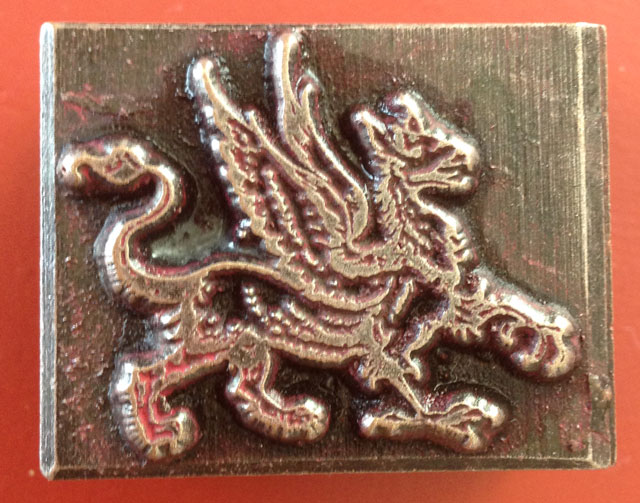
A New Logo for Me!
For a couple of years I had a website. My sister was building it for me, however it was never finished. Not because of her, mind you, but me. Because I am the slowest, dork of a painter ever. Happily, now that I actually have some works to put up, we are at it again!
 As I have been sharpening my illustrator and photoshop skills I thought I would try my hand at a logo for my new imaginary site. My idea for the logo came from a Christmas present of a moveable type stamp that was given to me by an awesome friend.
She found it in England and thought that I could use it as a type of signature for my paintings. It being a gryphon and all, I was sold.
Sadly, as a moveable type it is meant to be pressed into, and not stamped from. I took to the internets and found another stamp, though not as cool, and it is this stamp that I now use to "sign" the back of my paintings.
Below are some of the logo ideas I came up with, although in the end another sister will be making my actual logo. As her's will be a billion times better. The first two were made in illustrator, the last two in photoshop:

 I use a red ink pad to stamp my "signature," hence the red images. Depending on the colors we choose for the site I may be getting a different color pad, but I do really like the last one.
She found it in England and thought that I could use it as a type of signature for my paintings. It being a gryphon and all, I was sold.
Sadly, as a moveable type it is meant to be pressed into, and not stamped from. I took to the internets and found another stamp, though not as cool, and it is this stamp that I now use to "sign" the back of my paintings.
Below are some of the logo ideas I came up with, although in the end another sister will be making my actual logo. As her's will be a billion times better. The first two were made in illustrator, the last two in photoshop:
Monday, January 11, 2016
Color Temperature: A Pigment's Tell and a little bit about Blue
The other day I was wondering what the difference was between Ultramarine Blue and French Ultramarine Blue (because that is something normal people wonder about), and I learned something new about color temperature.
 99% of the time the color temperature of a paint is easy to tell, but then there is that 1%. For me, it is with blues. I forget which is which and need to look them up. Before, in my head I classified colors into how close they were to blue or orange, blue being the coolest and orange being the warmest.
 The problem that I ran into with trying to decide the temperature of Ultramarine and French Ultramarine, beyond that they are both blue and therefore cooler than most colors, is that they reside on opposite sides of "true blue." Does this make the both of them warm, since they are moving away from blue? But then how does that work with cool blues? I was confused and took to the internets.
I found a lovely little post from the American Society of Botanical Artists that explained the difference between warm and cool in a way that should have been obvious.
Most pigments will either have a green or red bias, not an orange or blue bias. Those with a green bias are cool while those with a red bias are warm. Thinking of warm and cool in this way simplifies, at least for me, color temperature.
Ultramarine has a slight green bias and therefore is cool. French Ultramarine leans towards violet with a slight red bias and therefore is warm. Ta da! Mystery solved! You can read more about their differences here.
You can also read about why color temperature is important for accurate lights and shadows here and check out my main Tips and Techniques page for more information about painting.
Thursday, January 7, 2016
Barn Owl: Part 1
I have a secret, I have not been painting very much lately. Illustrator and Photoshop have distracted me a bit, but I am back to it with desperation. I want to have this painting finished by the 16th for a gallery gig...right... so far I am moving at a pretty good pace, so hopefully. I have been listening to Mozart nonstop in hopes that he will help me concentrate.


Underdrawing: Pthalo Blue
Underpainting: Vandyke Brown
Overpainting and details: Titanian/Zinc White, Naples Yellow, Yellow Ochre, Indian Yellow, Alizarin Permanent, French Ultra Marine, Pthalo Blue, Red Iron Oxide, Van Dyke Brown, Payne's Gray
Tuesday, January 5, 2016
About an Artist: Josie Morway
The other day I was explaining to a friend the sometimes intense feelings of combat with one's fellow art students. You see, when you are in an art class, there is always a point in the day when every single person will get up to "stretch their legs" and to "see what others are working on." When in reality they are summing everyone up to see who has won the day. I thought, for a while, that I was the only one who summed up their art educational experience in competitive terms of who won and who lost, until one day in figure drawing. I was sharpening my pencil when a girl walked by my easel. I watched as she poked a friend and said, "She won, again." I was elated!
When perusing the internets, I sometimes find artists that I have beat (this is rare), artists where we can part amicably, and then artists who punch me into the ground and walk away laughing as they wipe blood and paint from their hands onto their perfectly formed ass. Josie Morway is one of those artists.
I found her today while reading a post about the Haven Gallery. She has great hair, coolies tattoos, is prego, is a triathlete, and paints oh so well.
She even does great instagram photos of her works:
 "Don't mind me as I eat my grape fruit, drink my coffee, and bask in my own greatness." I would too if I had instagram photos like these! I mean, if I had instagram photos at all. I really should start doing that.
Below are some of her works, but I also highly recommend checking out her web and etsy sites.


 All self deprecating aside, I love finding artists like her, Kevin Taylor, Juan Travieso, or Tiffany Bozic. It is when I do that I really feel the need to push myself and go to the mattresses.
When perusing the internets, I sometimes find artists that I have beat (this is rare), artists where we can part amicably, and then artists who punch me into the ground and walk away laughing as they wipe blood and paint from their hands onto their perfectly formed ass. Josie Morway is one of those artists.
I found her today while reading a post about the Haven Gallery. She has great hair, coolies tattoos, is prego, is a triathlete, and paints oh so well.
She even does great instagram photos of her works:
Below are some of her works, but I also highly recommend checking out her web and etsy sites.
Monday, January 4, 2016
Tonking: How to Smooth Paint Strokes or Paint Thickness without Disturbing the Paint
Tonking is a very useful tool to have in your artist tool kit. Named after Henry Tonks, tonking is when a piece of paper (newspaper, rag, or paper towel) is used to smooth painting strokes or reduce the thickness of paint without disturbing the painting surface.
Take the images below, for example. I was unhappy with the colors of the kitten's paws (far left image) and decided to paint a transparent, color-correcting, blue glaze over them (center image). After painting the glaze I had three problems: too much medium, too much paint, and visible brush strokes.

Using a paper towel, I tonked the blue paint by covering the paw, and then rubbing in order to remove some of the blue paint.
 I continued to tonk the paws until the desired amount was removed.
In order to remove brush strokes I could have also used a fan brush, but a fan brush would have disturbed the placement of the paint. Use tonking in lieu of a fan brush when you like the placement of the paint but need to:
1. reduce the amount of paint
2. reduce the amount of medium
3. reduce brush strokes without disturbing the paint
For more about painting, check out my main Tips and Techniques page.
Take the images below, for example. I was unhappy with the colors of the kitten's paws (far left image) and decided to paint a transparent, color-correcting, blue glaze over them (center image). After painting the glaze I had three problems: too much medium, too much paint, and visible brush strokes.
Using a paper towel, I tonked the blue paint by covering the paw, and then rubbing in order to remove some of the blue paint.
In order to remove brush strokes I could have also used a fan brush, but a fan brush would have disturbed the placement of the paint. Use tonking in lieu of a fan brush when you like the placement of the paint but need to:
1. reduce the amount of paint
2. reduce the amount of medium
3. reduce brush strokes without disturbing the paint
For more about painting, check out my main Tips and Techniques page.
Subscribe to:
Posts (Atom)