
Let's discuss.
Today I will be covering the difference between the basic blacks (Mars Black, Ivory Black, Lamp Black, and Payne's Gray) as well as why black has a bad rap, and how to mix your own black.
Mars Black: Named for the alchemical name of iron, Mars, it was traditionally made from a black iron oxide.
Mars black is a matte, very opaque black with a warm, brown undertone. Not as "black" as some others on the list, but a mega strong tinter. This was the choice black for Neo-Expressionists, like Anselm Kiefer, who just wanted BLACK in their paintings.
Ivory Black: Named for its traditional processing method, roasting elephant tusks, it is related to its out of date cousin, Bone Black.
Ivory black is a semi-transparent black with a slightly warm, brown undertone. It is a blacker-black than Mars Black, and while a solid tinter, it is about three times weaker than Mars Black. It is the all-purpose black and is a solid choice for mixing grays and creating colored shades.
Lamp Black: Named for its traditional processing method, collecting the residual soot of burnt oil lamps (waste not want not), it is made of pure carbon and is one of the oldest pigments. It has also been called Carbon Black, Vine Black, and Charcoal Black.
Lamp Black is a semi-opaque black with a cool, blue undertone. It is great when you want bluer shades and cool blue grays.
Payne's Gray: Named after the 18th century water-colorist William Payne. Payne often recommended it to his students as an alternative to plain black and it is a mixture of Ultramarine Blue, Mars Black, and sometimes Crimson.
Payne's Gray is a semi-opaque black with a strong, cool blue undertone. It is the coolest black on the list and has a moderate tinting strength. Landscape artists like to mix it with different yellows in order to create varying tones of deep green.
How to Mix your Own Black
Light is additive, in order to get to black you would have to remove all light/color. In the real world, this doesn't naturally happen. Pigments are subtractive, in order to mix black you add all the colors together. Here are two ways to mix black:
1. Mixing blue with red and then adding yellow makes black. It can be a very pretty, dynamic and colorful black.
2. Mixing perfect compliments together will give you gray, but like the deepest gray possible...so really it gives you black. Matching perfect compliments can be difficult, if two colors are compliments, but not perfect you will get brown.
Gamblin has taken the guess work out of matching compliments for you with their Chromatic Black. It is a transparent black and is also neutral in color temperature. I have never tried it, but I think I want to.
The Bad Rap of Black
The Bad Rap of Black

Monet painting at the Edge of a Wood, John Singer Sargent, 1887
Have you ever heard that you should never use black in your paintings, because black does not "exist" in the real world? Wanna know who gave black a bad rap? Impressionists. That's right... the most "beloved" of all, the Impressionists.
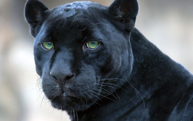
To be fair, straight black doesn't actually exist in the real world. Hold the phone! Really? What about black panthers or jaguars? Take a look, they are blue.
There is a nice little story about the above painting when Sargent was visiting Monet and asked Monet if he could borrow some paints. Here is the moment according to Monet:
"I gave him my colours, and he wanted black and I told him, 'but I haven't any,' 'then I can't paint' he cried, 'how do you do it?'"
(rolling eyes)
To Black or not to Black
I used to heavily camp out in the "No Black" club. Eventually I started wanting a black, so I mixed my black and I was happy to do it. Until I realized, "Man, I use a lot of paint to get the black I want." I didn't want to use a "plain" black, because using a black straight out of a tube can make your painting look a little dead and flat, but that isn't necessarily a bad thing:

Luncheon on the Grass, Edouard Manet, 1863
Color Temperature and Picking the Right Black
Using a tube black can help speed up the painting process, minimize the amount of wasted paint, and help you have more consistency throughout multi-day painting sessions. Knowing which black to use, with the right undertone and color temperature, is half the battle.
If you are mixing a warm black with cool colors in order to paint a cool shadow, you are going to get frustrated. Your black should always have the same color temperature as the colors you are mixing it into.
Ivory Black is a warm, all around great black. Add Ivory Black to warm colors to maintain a warm color temperature. Payne's Gray can really help you round out your palette as it is the coolest black. Add Payne's Gray to cool colors to maintain a cool color temperature.
If, however, you want to just have a neutral black that won't change the color temperature at all, use Gamblin's Chromatic Black.
All of the above information came from here, here and here. If you would like to read more about the cultural and historical significance of black, read here.
For more about other colors check out my main Tips and Techniques page.
For more about other colors check out my main Tips and Techniques page.
Thanks for the low down on blacks. Very informative. I never use blacks in watercolour painting which I have done for many years, but now I use Acrylics a lot and I use black all time as a mixer. This will help me choose
ReplyDeleteOh great! I am so happy to hear that!
DeleteThis comment has been removed by the author.
ReplyDeleteThe "K" in CMYK has always been my fav additive to pretty nearly everything...this article was fantastic (found you via web search ('duck-duck-go,' I believe) for 'historical use charcoal as black'). You scribe with inclusion and are succinct and more than I was questing for this morn... Cheers and happy eye- and heart-food. :)
ReplyDeleteoh I am so happy! Also thanks for letting me know how you found this post. Lots of people read it but I could never figure out how they found it.
DeleteThanks for the great explanation! Please change the word compliments with ‘complements’. 😉
ReplyDeleteInformative and interesting article !!
ReplyDeleteThis is a clear and useful explanation of different black pigments and how each one affects tone and mixing in painting. It nicely shows that “black” is not just one shade, but a range of warm and cool variations that artists can use creatively instead of relying on a single flat black.
ReplyDeleteFor more updates and related content, check here: teatime results
Really informative post I like how clearly you broke down each type of black and explained their undertones, opacity, and practical use in painting. The section about color temperature and mixing your own black was especially helpful, it really shows how much control artists can have over their palette instead of relying on a single tube black. I also came across something similar while reading related creative content on drivetime results which fits nicely with this kind of art and color theory discussion.
ReplyDelete