Pages

Thursday, January 14, 2016

RIP Alan Rickman

I have loved you since...


and


Wednesday, January 13, 2016

Delve Video Essays: The Long Game Parts 1, 2, and 3

Below are three video essays on the importance of the "long game" as an artist and the necessity to see the hard times through. Obviously the ideas presented here can apply to anyone, not just artists.

Colossal - Painting in the Dark 
In the age of social media and the over-saturation of information, seeking recognition as an artist or designer can at times be a difficult, self-defeating effort. Creative individuals understandably have high expectations for the reception of their work, and hope for a public response that correlates with the labor spent on its products. In Adam Westbrook's new video essay[s] we get a fantastic argument against the perceived value of modern popularity tied to social media likes and shares. 


I am not 100% solid on the ideas presented in the videos. Mostly because I don't think that you are less of an "artist" for wanting recognition, nor do I think you are more of an "artist" because you suffer for art's sake as a complete autotelic. However, even with that, it can be helpful to have some perspective. 

What do you think? Should the end goal be autotelicy (made up the word), or being able to feed yourself doing something that you love? 

Also, I think that I will be creating a new link for my Art Tips and Techniques page, something like Helpful Videos for Artists. 

A New Logo for Me!

For a couple of years I had a website. My sister was building it for me, however it was never finished. Not because of her, mind you, but me. Because I am the slowest, dork of a painter ever. Happily, now that I actually have some works to put up, we are at it again!

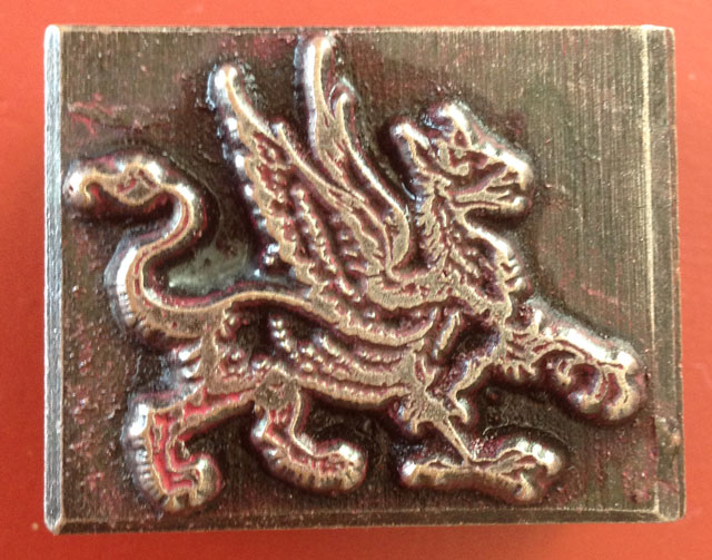
As I have been sharpening my illustrator and photoshop skills I thought I would try my hand at a logo for my new imaginary site. My idea for the logo came from a Christmas present of a moveable type stamp that was given to me by an awesome friend.

She found it in England and thought that I could use it as a type of signature for my paintings. It being a gryphon and all, I was sold.

Sadly, as a moveable type it is meant to be pressed into, and not stamped from. I took to the internets and found another stamp, though not as cool, and it is this stamp that I now use to "sign" the back of my paintings.

Below are some of the logo ideas I came up with, although in the end another sister will be making my actual logo. As her's will be a billion times better. The first two were made in illustrator, the last two in photoshop:


I use a red ink pad to stamp my "signature," hence the red images. Depending on the colors we choose for the site I may be getting a different color pad, but I do really like the last one.

Monday, January 11, 2016

Color Temperature: A Pigment's Tell and a little bit about Blue

The other day I was wondering what the difference was between Ultramarine Blue and French Ultramarine Blue (because that is something normal people wonder about), and I learned something new about color temperature.

99% of the time the color temperature of a paint is easy to tell, but then there is that 1%. For me, it is with blues. I forget which is which and need to look them up. Before, in my head I classified colors into how close they were to blue or orange, blue being the coolest and orange being the warmest.
The problem that I ran into with trying to decide the temperature of Ultramarine and French Ultramarine, beyond that they are both blue and therefore cooler than most colors, is that they reside on opposite sides of "true blue." Does this make the both of them warm, since they are moving away from blue? But then how does that work with cool blues? I was confused and took to the internets.

I found a lovely little post from the American Society of Botanical Artists that explained the difference between warm and cool in a way that should have been obvious.

Most pigments will either have a green or red bias, not an orange or blue bias. Those with a green bias are cool while those with a red bias are warm. Thinking of warm and cool in this way simplifies, at least for me, color temperature.

Ultramarine has a slight green bias and therefore is cool. French Ultramarine leans towards violet with a slight red bias and therefore is warm. Ta da! Mystery solved! You can read more about their differences here.

You can also read about why color temperature is important for accurate lights and shadows here and check out my main Tips and Techniques page for more information about painting.

Thursday, January 7, 2016

Barn Owl: Part 1

I have a secret, I have not been painting very much lately. Illustrator and Photoshop have distracted me a bit, but I am back to it with desperation. I want to have this painting finished by the 16th for a gallery gig...right... so far I am moving at a pretty good pace, so hopefully. I have been listening to Mozart nonstop in hopes that he will help me concentrate.

Underdrawing: Pthalo Blue 
Underpainting: Vandyke Brown 


Overpainting and details: Titanian/Zinc White, Naples Yellow, Yellow Ochre, Indian Yellow, Alizarin Permanent, French Ultra Marine, Pthalo Blue, Red Iron Oxide, Van Dyke Brown, Payne's Gray  


Tuesday, January 5, 2016

About an Artist: Josie Morway

The other day I was explaining to a friend the sometimes intense feelings of combat with one's fellow art students. You see, when you are in an art class, there is always a point in the day when every single person will get up to "stretch their legs" and to "see what others are working on." When in reality they are summing everyone up to see who has won the day. I thought, for a while, that I was the only one who summed up their art educational experience in competitive terms of who won and who lost, until one day in figure drawing. I was sharpening my pencil when a girl walked by my easel. I watched as she poked a friend and said, "She won, again." I was elated!

When perusing the internets, I sometimes find artists that I have beat (this is rare), artists where we can part amicably, and then artists who punch me into the ground and walk away laughing as they wipe blood and paint from their hands onto their perfectly formed ass. Josie Morway is one of those artists.

I found her today while reading a post about the Haven Gallery. She has great hair, coolies tattoos, is prego, is a triathlete, and paints oh so well.

She even does great instagram photos of her works:

"Don't mind me as I eat my grape fruit, drink my coffee, and bask in my own greatness." I would too if I had instagram photos like these! I mean, if I had instagram photos at all. I really should start doing that.

Below are some of her works, but I also highly recommend checking out her web and etsy sites.


All self deprecating aside, I love finding artists like her, Kevin Taylor, Juan Travieso, or Tiffany Bozic. It is when I do that I really feel the need to push myself and go to the mattresses. 

Monday, January 4, 2016

Tonking: How to Smooth Paint Strokes or Paint Thickness without Disturbing the Paint

Tonking is a very useful tool to have in your artist tool kit. Named after Henry Tonks, tonking is when a piece of paper (newspaper, rag, or paper towel) is used to smooth painting strokes or reduce the thickness of paint without disturbing the painting surface.

Take the images below, for example. I was unhappy with the colors of the kitten's paws (far left image) and decided to paint a transparent, color-correcting, blue glaze over them (center image). After painting the glaze I had three problems: too much medium, too much paint, and visible brush strokes.


Using a paper towel, I tonked the blue paint by covering the paw, and then rubbing in order to remove some of the blue paint.

I continued to tonk the paws until the desired amount was removed.

In order to remove brush strokes I could have also used a fan brush, but a fan brush would have disturbed the placement of the paint. Use tonking in lieu of a fan brush when you like the placement of the paint but need to:

1.  reduce the amount of paint
2.  reduce the amount of medium
3.  reduce brush strokes without disturbing the paint


For more about painting, check out my main Tips and Techniques page.